Napkin
Category AI Office
Published 2026-04-04

Overview

This section highlights the core features, use cases, and supporting notes.

Napkin is an AI visual-explanation tool for users who already have the words but need clearer diagrams, frameworks, and slide-ready visuals faster. It is strongest in business storytelling, training, and knowledge sharing because it turns text into structured visuals that can be edited and exported for real presentation use.

Napkin is useful because many teams do not need an image generator when the real problem is explanation. A strategy note, process breakdown, product concept, or training outline often becomes easier to share once the text is turned into a clear visual structure instead of another dense page of paragraphs.

It fits consultants, operators, trainers, product teams, educators, and anyone who frequently explains flows, comparisons, systems, or ideas to other people. The official homepage frames Napkin as visual AI for business storytelling, which matches the strongest use case: turning working text into visuals that can live in slides, docs, and internal communication.

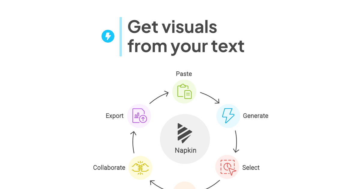
What makes Napkin worth keeping is that it starts from your text instead of asking you to become a prompt engineer or a designer. The product flow on the official site is straightforward: paste or import text, generate visuals, refine them, and export them as PPT, PNG, PDF, or SVG. That is productivity, not decoration.

The tradeoff is that Napkin will amplify structure, not invent it from chaos. If the source text is vague, repetitive, or badly organized, the generated visual will still feel weak. The practical expectation is faster business communication once the underlying idea is already clear enough to explain.

This site recommends Napkin for people who repeatedly turn knowledge into shareable materials. If you often need to explain a process, summarize a framework, or turn meeting logic into visuals that others can understand quickly, Napkin is much more useful than a general-purpose image tool.

Setup / Usage Guide

Installation steps, usage guidance, and common notes are maintained here.

  1. Open Napkin from the official site and start on desktop. The editing and export workflow is easier to judge properly on a larger screen than on a phone.
  2. Begin with one tight block of source text. A process explanation, a comparison, or a short structured brief works much better than a long messy report pasted in full.
  3. Generate visuals from meaning, not from noise. Remove filler lines first so Napkin works from the core logic instead of trying to visualize every sentence equally.
  4. Pick the visual that matches the communication goal. A process flow, hierarchy, comparison, or concept map should be chosen based on what the audience needs to understand fastest.
  5. Edit the wording after generation. Visual nodes should stay concise. If every box reads like a paragraph, the output will look busy even if the layout is correct.
  6. Adjust style only after the information is right. Color and formatting matter, but the real win is whether the audience understands the structure immediately.
  7. Export in the format that matches the next step. Use PNG or PDF for quick sharing, and use PPT or SVG when the visual still needs to be edited inside a larger presentation workflow.
  8. Keep both the source text and the visual output. Napkin becomes more valuable over time when you can revise the underlying explanation and regenerate a better visual instead of redrawing from scratch.

Related Software

Keep exploring similar software and related tools.