ChartGen
Category AI Office
Published 2026-04-05

Overview

This section highlights the core features, use cases, and supporting notes.

ChartGen is an AI chart generator for users who want raw data turned into readable visual charts faster without spending most of the time on manual formatting. It is most useful when the analysis already exists and the real delay is turning it into a chart that others can understand quickly.

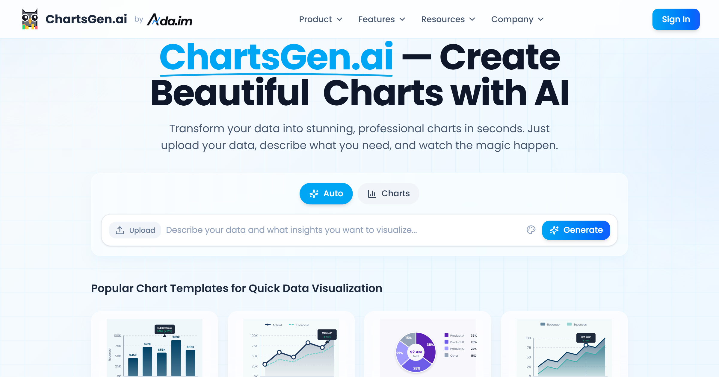
ChartGen is built for the data-presentation stage rather than for the analysis stage itself. Its value comes from helping users move from tables or instructions to usable charts quickly enough that communication does not become the slowest part of the workflow.

It suits analysts, operators, product teams, educators, and managers who repeatedly need simple, clean charts from data. The fit becomes strongest when speed and clarity matter more than highly customized visual design.

What makes ChartGen worth attention is that chart formatting can waste disproportionate time after the real thinking is already done. A tool that removes much of that friction can improve reporting speed and reduce presentation delay.

The tradeoff is that automatic chart generation can make users trust the visual too quickly. Axes, labels, categories, and selected chart types still need human review so the final message stays honest and readable.

This site recommends ChartGen for people who want faster chart production from existing data. Start with one real reporting need, then keep it if the tool saves time without introducing visual mistakes or misleading structure.

Setup / Usage Guide

Installation steps, usage guidance, and common notes are maintained here.

  1. Open ChartGen from the official site and begin with one dataset or reporting need you already have. A real use case is the right benchmark for a chart tool.
  2. Describe the chart goal clearly before generating. A line chart for trend reading and a pie chart for composition are not interchangeable just because both look simple.
  3. Review whether the chosen chart type matches the story in the data. Fast generation helps only when the visual logic is still right.
  4. Check labels, units, and values carefully. Small chart errors can make the entire output misleading.
  5. Compare the generated chart against your current manual workflow. The practical question is whether it saves time without sacrificing trust.
  6. Use the chart in the real report or deck before deciding it is done. Presentation context often reveals spacing or clarity problems.
  7. Keep the audience in mind. A technically correct chart is still weak if non-specialists cannot read it quickly.
  8. Keep ChartGen if it consistently turns data into clear visual output faster while still leaving you confident in the result. That is the strongest reason to keep it.

Related Software

Keep exploring similar software and related tools.